Configure a Bar Chart
Bar charts are available as two types:
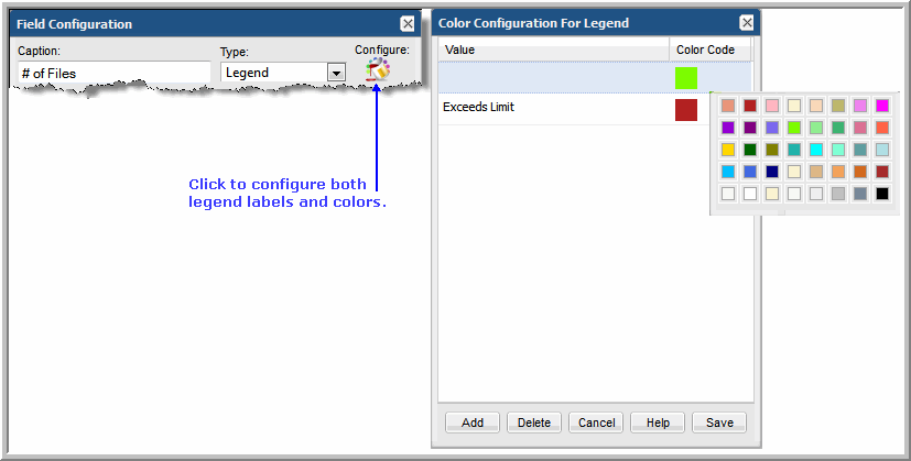
• Dynamic: With this data-driven type of chart, the system represents the data that is available and you don’t need to know how many distinct values are available. Typically, this means that you do not select colors for the bars, but let the system select them. In some cases, colors are available for selection for a limited set of known values. A dynamic bar chart requires 1 Caption, 1 Bar, and 1 Legend. In a Dynamic Bar Chart, you cannot define the tooltips for the bars.
• Static: With this type of chart, the author of the template pre-defines only the values and colors that will be represented in the chart—typically, a subset of the full set of values. A static bar chart requires 1 Caption and at least 1 Bar. Since each bar is pre-defined, you can include a percentage line in a Static Bar Chart.
Best Practices
Use the Static option if you require one of the following:
• tabular report created from a bar chart
• specific set of colors in reports
• specific captions for reports; for example, job status values of Successful, Warning, and Failed.
The easiest way to learn how to create a bar chart is by example, as described in these sections:
Bar Chart Example
Use Case: As a manager, I’d like to see a list of daily backup jobs so that I can easily determine the success and failure rate. In addition, I’d like to be able to drill down to the details, especially for failed backups.
When creating a report, always start with a problem statement so that you can identify the characteristics that are essential for your report. For this example, our problem statement requires:
• Time component, such as a backup job start or finish date
• Status of the backup job, such as successful, warning, or failed
Bar charts are available as two types:
• Dynamic: With this type of chart, you don’t need to know how many distinct values are available. Typically, this means that you do not select colors for the bars, but let the system select them. In some cases, colors are available for selection for a limited set of known values. A dynamic bar chart requires 1 Caption, at least 1 Bar, and 1 Legend.
• Static: With this type of chart, you pre-define only the values and colors that you want represented in the chart—typically, a subset of the full set of values. A static bar chart requires 1 Caption and at least 1 Bar.
Bar Chart Example Step 1: Create a Report Template
For this example—creating a report template for daily backup job status—you start with a Job enterprise object.
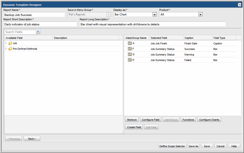
2. In the Dynamic Template Designer, enter text or select options at the top of the window.
Be sure to select
Display as Bar Chart. See also,
Type: Display as Bar Chart.
3. In the Dynamic Template Designer, expand the folders in the left panel and drag the following fields into the Selected Fields panel at the right. Note that as you drag fields into the selected panel, an Alias Name gets assigned to the field. As you remove and add fields, these alias names do not get reused.
• Job Finish Date - This provides the time component of the chart. The dates are used for the x-axis labels.
• Summary Status - In the description for this field, you’ll see that the summary status lists the explicit codes that denote the success or failure of a backup job. For the purpose of this example, we’ll be using three Summary Status fields to display Success, Warning, and Failed status.
Bar Chart Example Step 2: Configure Basic Field Functionality
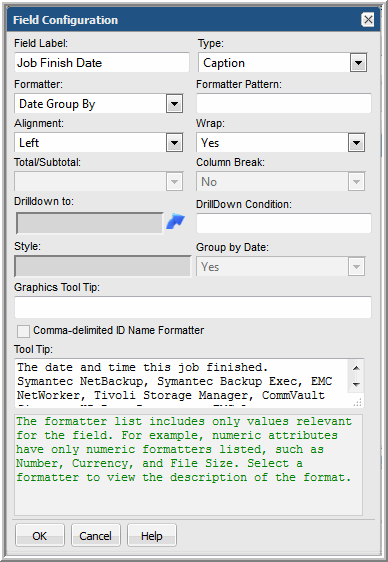
1. Double-click the Job Finish Date field in the Selected Fields panel and configure as shown:
• Formatter = Date Group By (This formatting is required in conjunction with the Group By Scope Selector setting to group values by the selected date.)
2. Double-click the Summary Status field and configure as follows:
• Field Label = Success
• Type = Bar
• Color = Green
3. Drag two additional Summary Status fields into the panel and configure each to represent the Warning and Failed backup job status bars.
Bar Chart Example Step 3: Configure Functions for a Field
Each of the Summary Status fields require two functions:
• DECODE, which detect and differentiate the status values, create counters for the status so that the number of backup jobs for the particular status can be tallied.
• SUM, which sums the number of backup jobs per status.
1. In the selected fields panel, select the Summary Status field that you’ve defined to represent the success status.
2. Click the Functions button at the bottom of the panel.
3. In the Function Builder window, click Add.
4. Select DECODE returns Decimal from the drop-down list of functions.
Note that only functions relevant to the selected field will be available. The majority of these functions are Oracle functions that enable you to manipulate values.
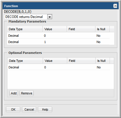
5. In the Function window, two mandatory parameters and one optional parameters must be configured.
• For the first Decimal, click in the Value cell and enter a 0. (Recall that in the description of this field,
0 = Success.)
• For the second Decimal, click in the Value cell and enter a 1.
• Click Add in the Optional Parameters section and enter a value of 0.
• Click OK to save the DECODE function’s configuration.
This configuration tells the system that whenever a zero is encountered for a job summary status, make it a 1 so that it can be added to the count of successful jobs; then, any other status will be set to 0 so that it will not get counted in this status.
6. Configure similar settings for the Warning Summary Status field:
• For the first Decimal, click in the Value cell and enter a 1. (Recall that in the description of this field,
1= Warning.)
• For the second Decimal, click in the Value cell and enter a 1.
• Click Add in the Optional Parameters section and enter a value of 0.
• Click OK to save the DECODE function’s configuration.
7. Configure similar settings for the Failed Summary Status field, where the DECODE parameters will be 2, 1, 0.
8. For each Summary Status field, click Functions and select SUM returns Decimal.
Bar Chart Example Step 4: Configure Drilldowns for a Field
While a bar chart provides an at-a-glance, visual representation of backup job success, it’s often useful to be able to drill down to details. You can achieve this by configuring a drilldown for each Summary Status field.
1. In the selected fields panel, double-click the Summary Status field that represents the success status.
2. Click the Drilldown to arrow.
3. In the Drilldown Configuration window, select a report that will be displayed when the user clicks on a section of a bar in the chart. For this example, select Job Summary.
4. Now you must tell the template what values should be passed to the drilldown report. For example, you want the Success portion of a bar to drill down to a Job Summary report that only lists successful backup jobs.
• In the Drilldown Configuration window, in the Parameter section at the bottom, click Add.
• In the Drilldown Parameter window, from the Parameter drop-down list, select the Summary Status field that represents the Success jobs.
• Operation = equals, Value = 0
5. Repeat these steps for each of the Summary Status fields, setting 1 for Warning and 2 for Failed.
Bar Chart Example Step 5: Define the Scope Selector
1. At the bottom of the Dynamic Template Designer window, click Define Scope Selector.
2. In the Scope Selector Components window, check Group By.
This setting must be selected so that the data can be grouped rather than enumerated for every time value. When the user runs this report template, a Group By selector will be available to choose the time grouping: Hours, Days, Weeks, Months, Quarters, or Years.
3. Click OK to return to the main Dynamic Template Designer window.
Bar Chart Example Step 6: Save and Run the Report Template
1. In the main Dynamic Template Designer window, click OK to save your work.
Your final report template window should look something like this:
Examples: Bar Chart Report Templates
The best way to learn how to define a bar chart report template is to learn by example.
The following list includes a sampling of the out-of-the-box reports that are shipped with the product, along with a few examples of the relevant information to help you isolate an example of the functionality that you are trying to implement.
To help you identify a field in the template that contains this functionality, the following convention is used in the list of report templates.
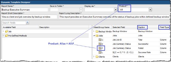
• Product:Alias combines the values listed in the template. In the following example, the selected Product is All, while the selected Alias is F.
• Some templates are vendor product-specific, in which case you may have a Product:Alias such as EMC Avamar:A
Report Template | Report Type | Product: Alias | Caption | Field Type | Functions |
Backup Manager Reports |
Job Status Summary | Bar | All: T | Failure | Bar | DECODE, SUM |
Job Volume Summary | Bar | All: D | # of Files Backed Up or Restored | Line | SUM |
| | All: B | # of Jobs | Hidden | COUNT |
| | All: C | Backup/Restore Volume | Bar | SUM |
Job Duration | Bar | All: F | Job Duration | Bar | SUM |