Configure a Stacked Bar Chart SQL Template
A stacked bar chart represents data with vertical bars. Rather than individual bars per data point, the values are stacked within a single bar. This type of chart can display bars only or it can be configured to include a line that will be charted on the right y-axis. See also:
Bar charts are all similar and rendering can be easily changed from one orientation to another (horizontal or vertical) or from stacked to individual bars. Once a SQL Template is developed for a bar chart, simply select the
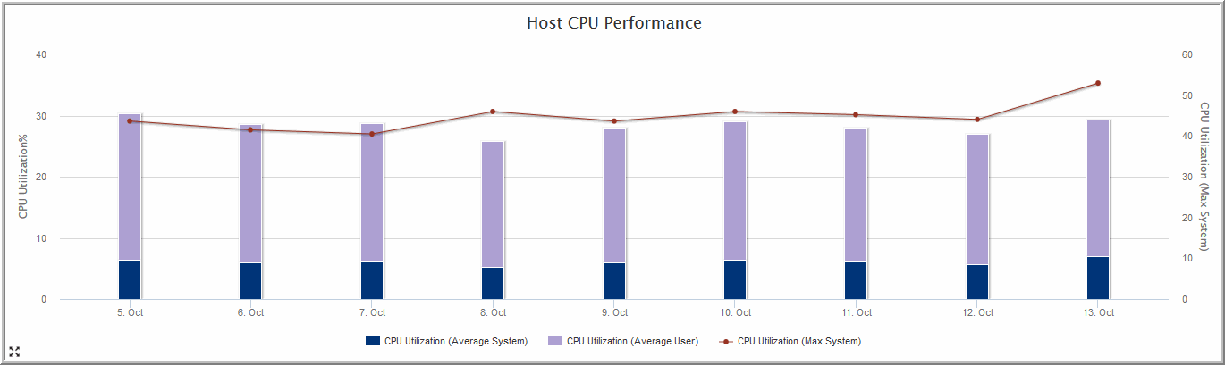
Example of a Stacked Bar Chart SQL Template: Host CPU Performance
1. From the SQL Template Designer tabbed window, select Date Range and Host Groups and Client Scope .
2. Select Static Custom Combo Box and click Configure at the bottom of the Query window.
3. Enter the heading for the drop-down list in the Static Custom Combo box—for this example, Group by:
4. Enter the following comma-separated list of values and then click OK: Hour,Day,Week,Month,Quarter,Year
These will be the options that a user can select when generating a report.
5. Click on the Query tab and enter the following query:
SELECT
trunc(log_date,DECODE('${freeCombo1}','Hour','HH24','Day','DD','Week','WW','Month','MM','Quarter','Q','Year')) the_date,
avg(system_processing_time_pct) avg_system,
avg(user_processing_time_pct) avg_user,
max(system_processing_time_pct) max_system
FROM apt_v_host_cpu_log
WHERE log_date between ${startDate} AND ${endDate}
GROUP BY trunc(log_date,DECODE('${freeCombo1}','Hour','HH24','Day','DD','Week','WW','Month','MM','Quarter','Q','Year'))
6. Click Validate Query and then Next.
7. In the Formatting window, select Stacked Bar and set the Caption field to the_date with the Axis label set to CPU Utilization%
8. Check all four fields: the_date, avg_system, avg_user, and max_system.
9. One by one, select the bar fields, avg_system and avg_user, and click the Formatting button (at the bottom of the window) to configure the color of the bar. And, enter a relevant label for each field.
10. Select the max_system field and click the Formatting button (at the bottom of the window) to configure the color of the line.
11. Save the report to a report menu group. Then, click on the saved report to generate it.
The output for the stacked bar chart will look something like this: