Configure a Donut Chart SQL Template
A Donut Chart is similar to a Pie Chart. See also:
Example of a Donut Chart SQL Template: NetBackup Job Size by Job Type
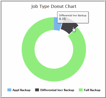
The following example results in a donut chart that represents the various job types—such as, application backups, full backups, incremental backups, and restores—as segments in a donut chart.
1. In the SQL Template Designer, do not check any Template Designer items.
2. In the Query window, enter the following select statement and click Validate Query:
SELECT job_type_name,
sum(kilobytes/1024/1024) Job_SIZE_GB
FROM APT_V_NBU_JOB_DETAIL
WHERE
finish_date > sysdate -7
AND job_type_name IS NOT NULL
GROUP BY job_type_name
ORDER BY job_type_name
3. In the Formatting window, select Donut Chart from the Display report as drop-down list.
4. For the Caption field, select job_type_name from the drop-down list.
5. Select all the fields to be displayed.
For a donut chart, you need at least one field to be the caption and another field to be the segment.
6. Click Next, enter a report name and Menu Group. Then, click Finish.
When you run this report, the output will look something like this:

