Configure a Bar Chart SQL Template
A bar chart represents data with vertical bars. This type of chart can display bars only or it can be configured to include a line that will be charted on the right y-axis. See also:
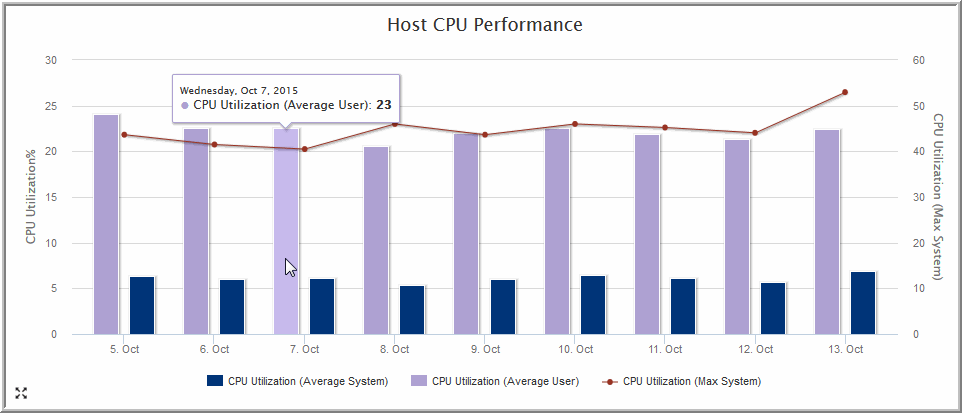
Example of a Bar Chart SQL Template: Host CPU Performance
The following example illustrates how to create a Bar Chart and then format it with a dual axis. This example produces a bar chart for Host CPU Performance.
1. From the Template Designer tabbed window, select Date Range and Host Groups and Client Scope and Static Custom Combo Box.
2. Create a query that has a field for the caption, each of the bars, and the line.
SELECT
trunc(log_date,DECODE('${freeCombo1}','Hour','HH24','Day','DD','Week','WW','Month','MM','Quarter','Q','Year')) the_date,
avg(system_processing_time_pct) avg_system,
avg(user_processing_time_pct) avg_user,
max(system_processing_time_pct) max_system
FROM apt_v_host_cpu_log
WHERE log_date between ${startDate} AND ${endDate}
GROUP BY trunc(log_date,DECODE('${freeCombo1}','Hour','HH24','Day','DD','Week','WW','Month','MM','Quarter','Q','Year'))
ORDER BY trunc(log_date,DECODE('${freeCombo1}','Hour','HH24','Day','DD','Week','WW','Month','MM','Quarter','Q','Year')) ASC
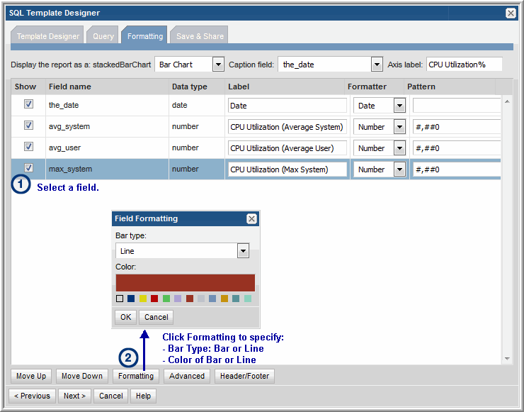
3. In the Formatting tabbed section, select each field (data points) and format each so that you have:
• 1 caption, n bars, and 1 line
Note: The line will be charted on the right-hand axis.
4. Set the color of the bars and specify the line formatting, as shown in the following screen.
5. Save the report to the My Reports report menu group. Then, click on the saved report to generate it.
The output will look something like this:


