Configure a Gauge Chart SQL Template
A gauge chart can be used to represent two data points, such as a percentage. For example, a gauge might be an effective chart to enable your management team to visualize the percentage of Tier 1 storage that has been used.
• Two data points are required to render a gauge chart.
Gauges are best used when you want to know that a threshold has been reached. Therefore, only three colors are used to represent a range of values. These thresholds and colors are defined by the system and cannot be modified.
Threshold | Color | Color Hex Value |
0.1-0.5 | Green | #55BF3B |
0.5+-0.9 | Yellow | #DDDF0D |
0.9+ and above | Red | #DF5353 |
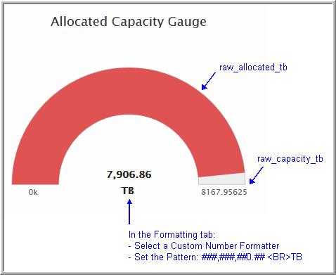
Example of a Gauge Chart SQL Template: Allocated Capacity
Use the following example to identify the properties to be configured in the SQL Template Designer.
1. For this particular example, a basic query was used:
SELECT
SUM(raw_allocated_gb/1024) AS raw_allocated_tb,
SUM(raw_capacity_gb/1024) As raw_capacity_tb
FROM aps_v_storage_array
2. In the Formatting tab, configure the Formatter and Pattern to include the unit of measure for the values represented in the gauge.